Using multiple fabric patterns in a space is a great way to add personality, interest and impress your guests by making – what seems a daunting task – look effortless. Using many layers of design gives your home a curated, lived-in feel. Consider all things; fabrics, artwork, rugs and accessories.
One of our most-asked questions is:
How can I use multiple fabric patterns in a room and make it work?
The key is balance (along with some other design principles)!
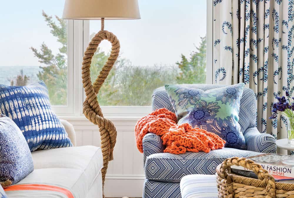
- The golden ratio calls for a balance of 60/30/10. Think thirds. Use at least 3 patterns in a room, considering their relationship to one another in terms of scale, color, frequency and placement. For example, a full-proof formula incorporates a small scale design (houndstooth, dot or animal print), larger scale (chevron, watercolor floral or ikat) along with a companion (geometric, stripe, bird print).
- Disperse pattern throughout the room and play with scale. If your sofa or chairs are upholstered in smaller stripes, checks or patterns, pop them with large statement bird or botanical print pillows. Do you have a pair of chairs in cut velvet or a bold pattern? Use solids focusing on the material content; a nubby neutral, soft suede, something with sheen to balance the look
- Think twice before putting tribal print bedding in the same room with ikat drapes or leopard print pillows on a leopard print loveseat. However, matching toile wallpaper and drapery works…the right balance can still be achieved within other elements in the room.
- Small rooms? Average ceilings? If you are in an older home or condo, your furniture is likely smaller and huge, explosive patterns everywhere will look disproportionate. Don’t abandon the styles you love, rather, small them down a bit. Pro Tip: Create height with vertical stripes and mount drapery as close to the molding as possible. Avoid chair rail and paint moldings a color that matches the walls.
- The more pattern you use, try to stay in the same color family, similar intensities or a complimentary palette.
- Rooms with soft, muted palettes can carry many different patterns.
- Large, open scale patterns can be unfussy and easy to work with.
Below, we’ve pulled together a few inspiring color stories using a variety of patterns. Imagine your own home and how these could be worked in. Give new life to an occasional bench or chair that lives in your entryway by inviting in a bold color or pattern. Drapery panels look finished and custom-made when using a fabric, like Malveira or Latticely, with a linear design that emulates tape or trim.
Let simple dining chair bottoms stand out with an unexpected dose of pattern or color. That neutral sofa doesn’t have to be solid and boring. Step out of your comfort zone with a small scale woven design or texture…or if you must use a solid, make it a memorable one…now pile on lots of pillows – these are the easiest design elements to change so have fun!
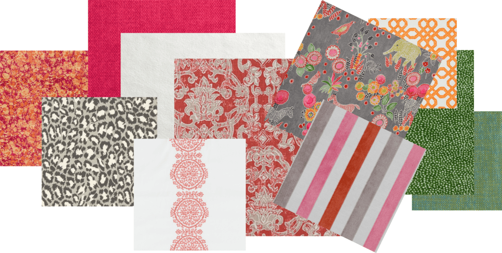
Shown above (l-r): Jonathan Adler Velino Fuchsia, DVF Spotted Cat Mink, Hitchcock Raspberry, Sensuede Snow, Lacefield Contessa Salmon, Tilton Fenwick Malveira Coral, Bahn Gray, Hamilton Watermelon, Well Connected Clementine, Siamese Glade, Virginia Seagrass
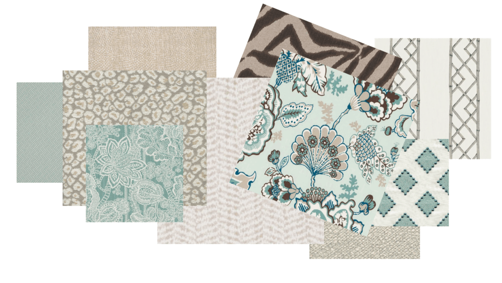
Shown above (l-r): Madcap Cottage Beach Club Celadon, Rox Stone, Hemmett Pearl, Tilton Fenwick Avillez Sea Green, Cline Natural, Florebela Sea Green, Lacefield Zebra Ikat Steel, Deck Frost, Sarah Richardson Diamondots Turquoise, Latticely Pewter
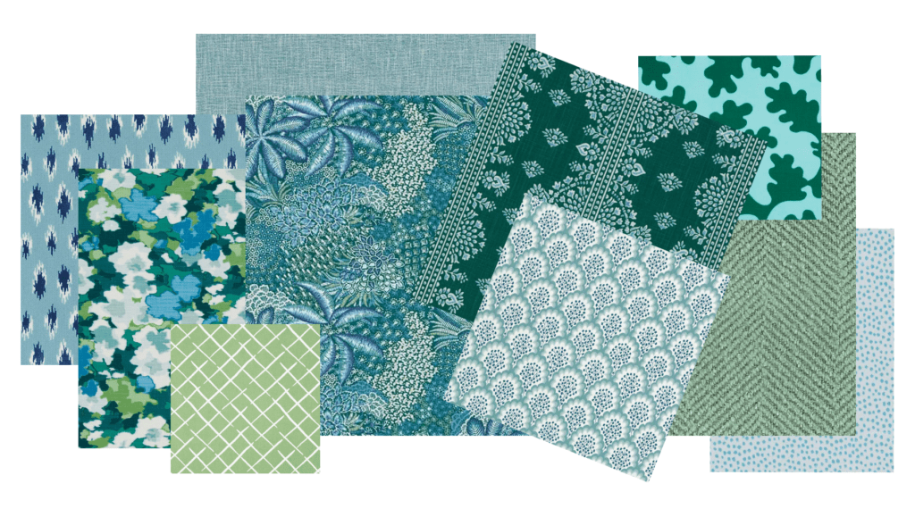
Shown above (l-r): Dimat Turquoise, Rousham Romp Marrakech Green, Cove End Palm, Tilton Fenwick Prados Peacock, Chiado Emerald, Alfama Emerald, Angelina Sea Green, Bruno Blue Green, Valdese Jumper Aruba, John Robshaw Bindi
Subscribe for fabric news and exclusive offers!
By submitting this form, you are consenting to receive marketing emails from: . You can revoke your consent to receive emails at any time by using the SafeUnsubscribe® link, found at the bottom of every email. Emails are serviced by Constant Contact